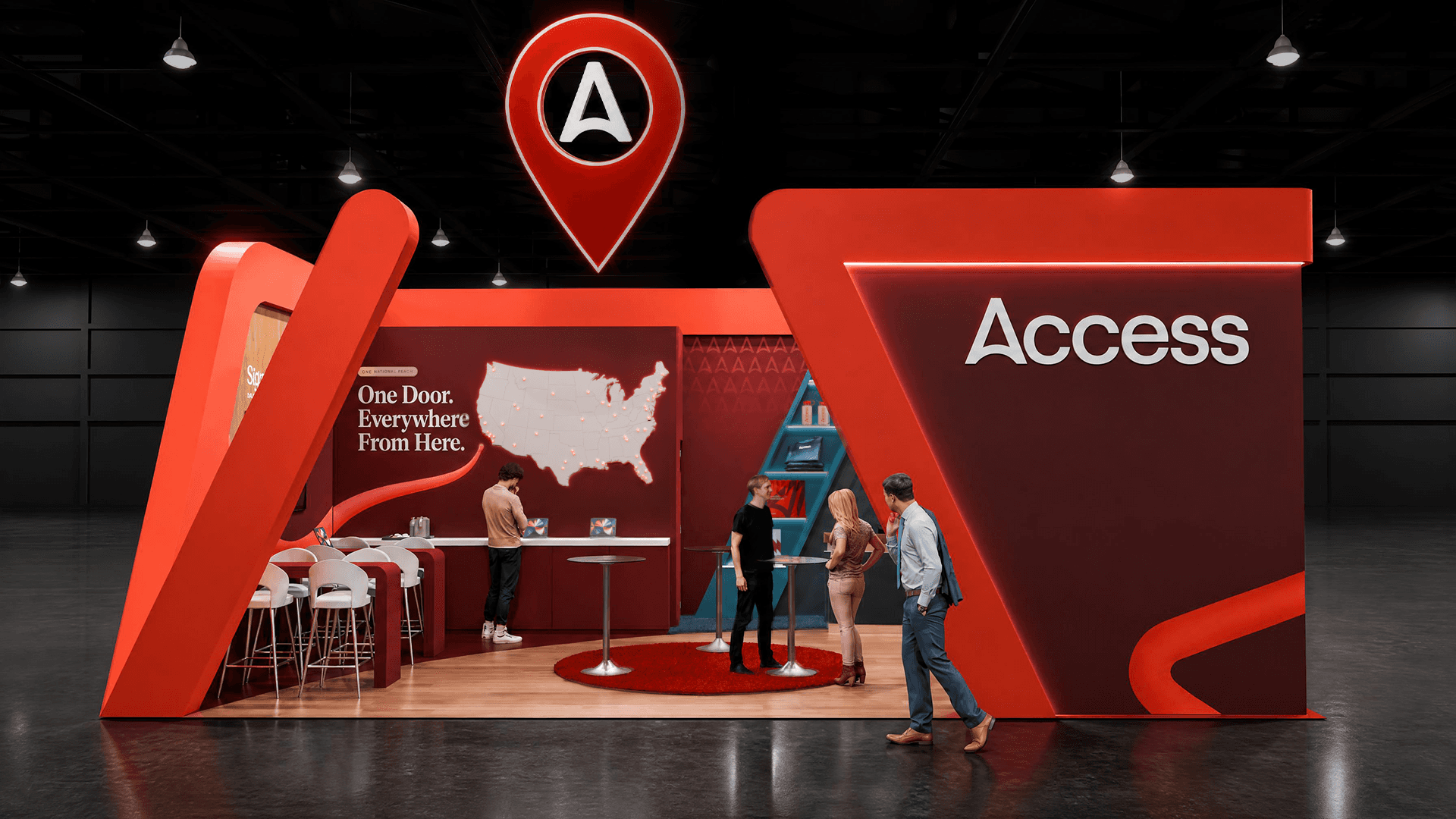
We wanted the booth to feel like visitors were entering the Access story. The red Experience Portal line became the guide, wrapping around the stand, pulling people inside, and leading them toward the map at the center of the space.

Gonzalo Hermida
Creative Director
We wanted the booth to feel like visitors were entering the Access story. The red Experience Portal line became the guide, wrapping around the stand, pulling people inside, and leading them toward the map at the center of the space.
Gonzalo Hermida
Creative Director
Designed with Gielissen for Access DMC at IMEX America 2026, this concept was built around a simple idea: turning a key element from the Access brand into part of the visitor journey. The red Experience Portal line moves around the outside of the booth, becomes part of the architecture, and continues into the space. Instead of working only as a graphic detail, it helps guide visitors inside and points them toward the map wall, where the Access network of destinations becomes the main focus. I worked closely with Gielissen and Emily Amyx-Lester, their Creative Director/Designer, to develop the concept and translate the brief into a space that felt clear, branded, and functional.
Designed with Gielissen for Access DMC at IMEX America 2026, this concept was built around a simple idea: turning a key element from the Access brand into part of the visitor journey. The red Experience Portal line moves around the outside of the booth, becomes part of the architecture, and continues into the space. Instead of working only as a graphic detail, it helps guide visitors inside and points them toward the map wall, where the Access network of destinations becomes the main focus. I worked closely with Gielissen and Emily Amyx-Lester, their Creative Director/Designer, to develop the concept and translate the brief into a space that felt clear, branded, and functional.
Creative challenges
The main challenge was giving the booth a strong identity while keeping it open and easy to navigate. Access needed meeting areas, hospitality moments, interactive elements, and space for short presentations during the event. At the same time, the booth had to invite people in from the aisle and make the story clear quickly. The red central area was designed as the heart of the stand: a flexible place for quick meetings, demonstrations, small presentations, and rotating displays. It gave the Access team a clear gathering point without making the booth feel too rigid or closed.
The goal was to make the space feel active and guided, but still simple enough for visitors to understand immediately.
Creative challenges
The main challenge was giving the booth a strong identity while keeping it open and easy to navigate. Access needed meeting areas, hospitality moments, interactive elements, and space for short presentations during the event. At the same time, the booth had to invite people in from the aisle and make the story clear quickly. The red central area was designed as the heart of the stand: a flexible place for quick meetings, demonstrations, small presentations, and rotating displays. It gave the Access team a clear gathering point without making the booth feel too rigid or closed.
The goal was to make the space feel active and guided, but still simple enough for visitors to understand immediately.




Design Approach
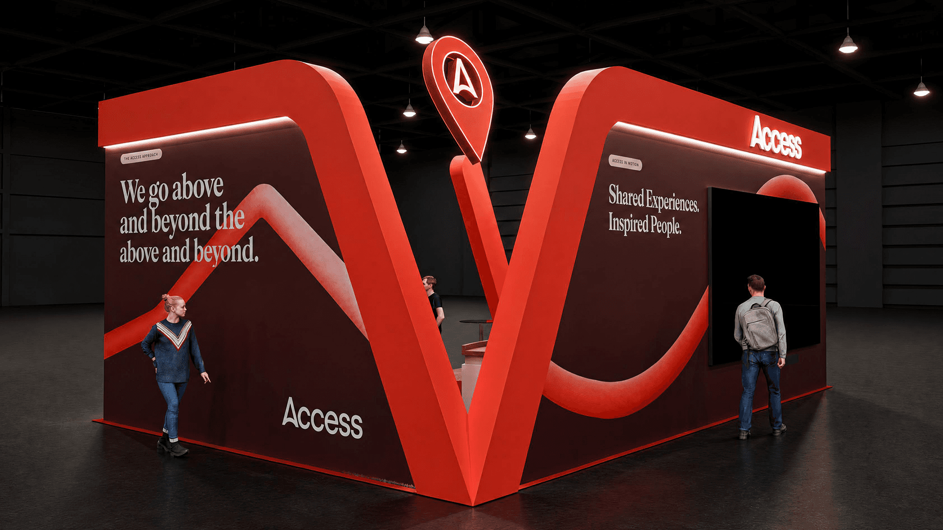
The design used the Access brand language as a spatial tool, not just as surface graphics. The Experience Portal line wraps around the booth and leads visitors toward the interior map, creating a clear path through the space. Inside, the blue slat wall added a more subtle brand moment: as visitors moved through the booth, the layered lines began to reveal the Access logo from specific angles. The booth also included moments for discovery, including the destination map, merchandise display, gallery elements, and beverage activation. Each one gave visitors a reason to pause, look closer, and start a conversation.
The result was a booth that used branding, layout, and interaction together to create a more natural Access experience.
Design Approach
The design used the Access brand language as a spatial tool, not just as surface graphics. The Experience Portal line wraps around the booth and leads visitors toward the interior map, creating a clear path through the space. Inside, the blue slat wall added a more subtle brand moment: as visitors moved through the booth, the layered lines began to reveal the Access logo from specific angles. The booth also included moments for discovery, including the destination map, merchandise display, gallery elements, and beverage activation. Each one gave visitors a reason to pause, look closer, and start a conversation.
The result was a booth that used branding, layout, and interaction together to create a more natural Access experience.
Latest projects
Events
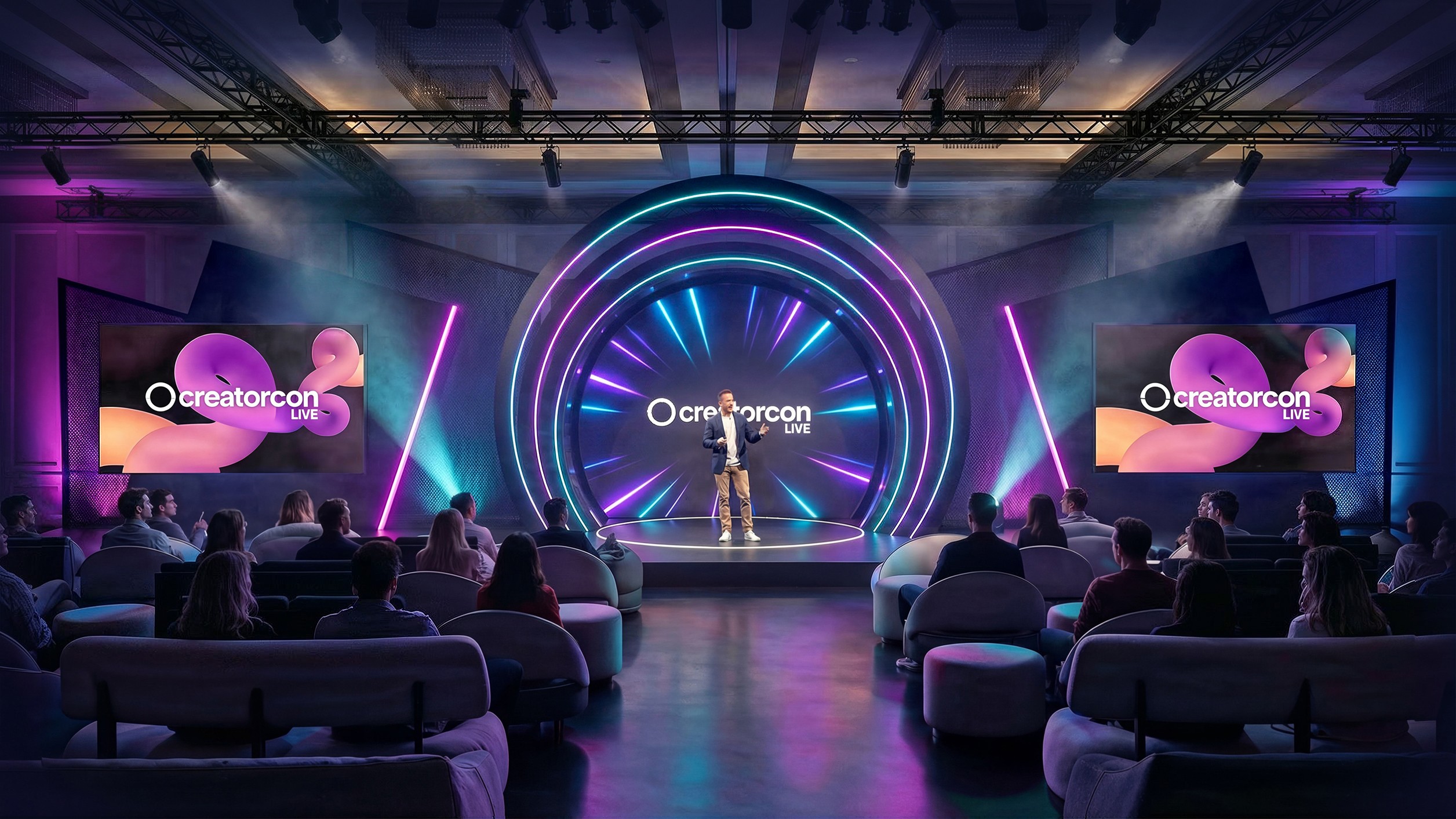
CreatorCon 2026 - Event Detroit
A multi-zone live event environment designed with Gielissen for creators, audiences, and brand experiences.
Events
CreatorCon 2026 - Event Detroit
A multi-zone live event environment designed with Gielissen for creators, audiences, and brand experiences.
Installations
Brand Experiences
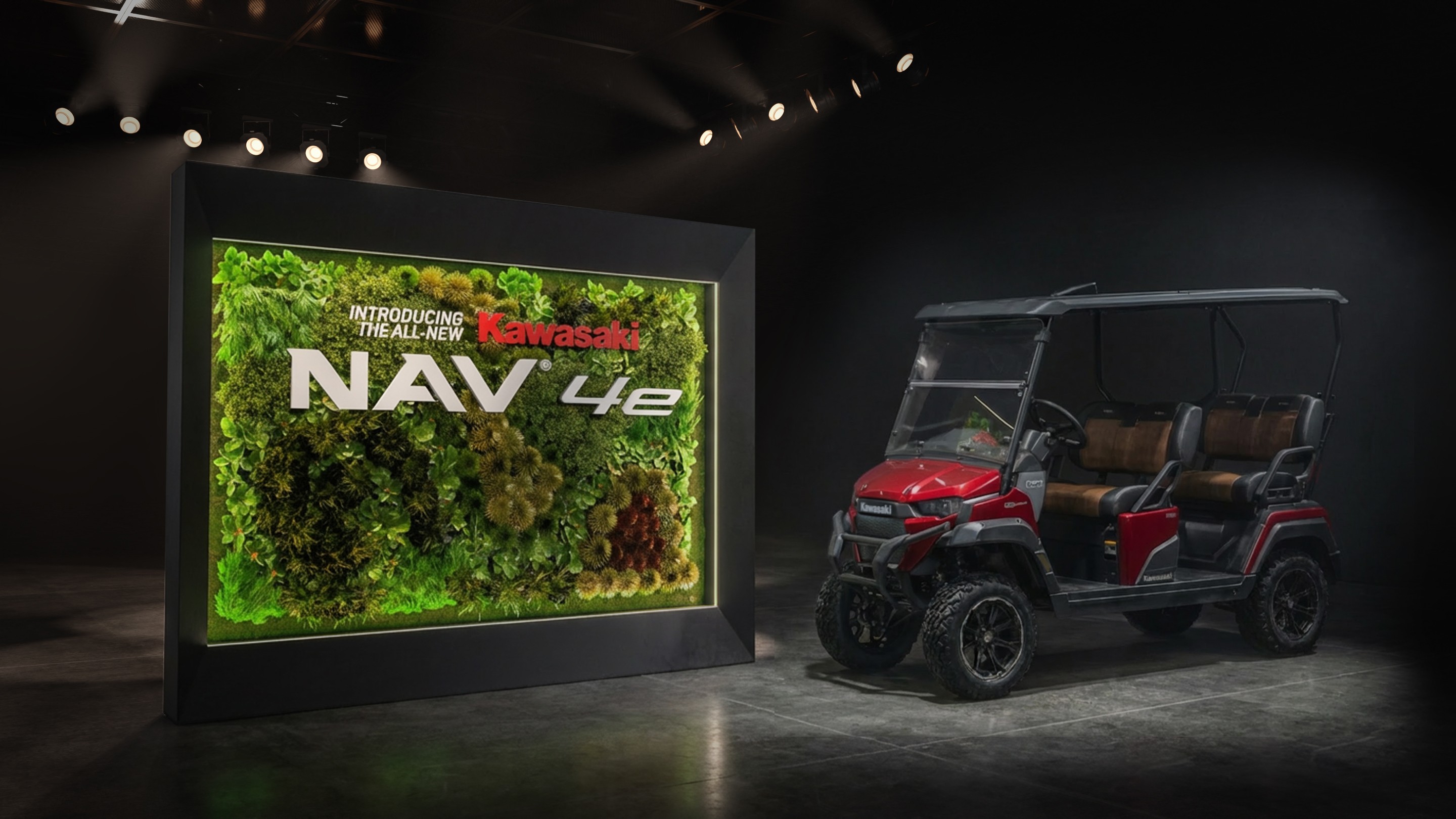
Kawasaki Display Installation
A modular product showcase designed for Gielissen, and built for trade show visibility and retail activation.
Installations
Brand Experiences
Kawasaki Display Installation
A modular product showcase designed for Gielissen, and built for trade show visibility and retail activation.
Latest projects
Events
CreatorCon 2026 - Event Detroit
A multi-zone live event environment designed with Gielissen for creators, audiences, and brand experiences.
Installations
Brand Experiences
Kawasaki Display Installation
A modular product showcase designed for Gielissen, and built for trade show visibility and retail activation.

